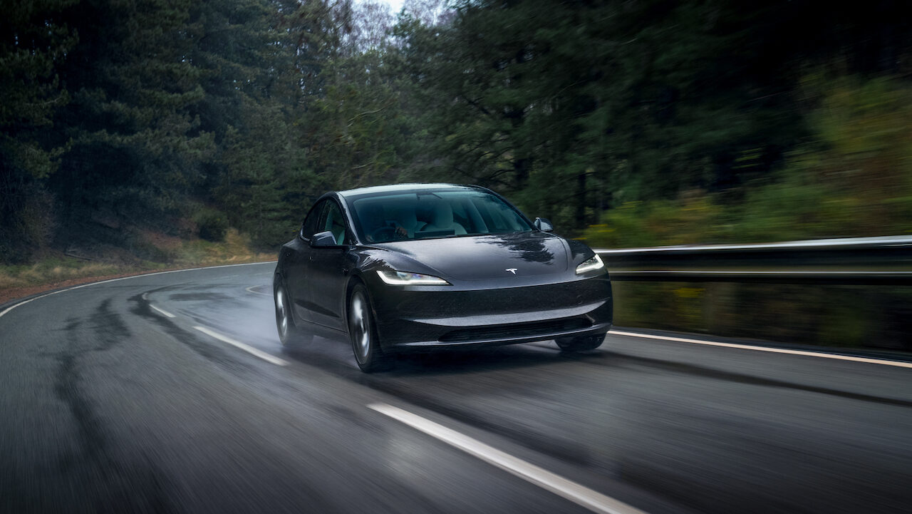
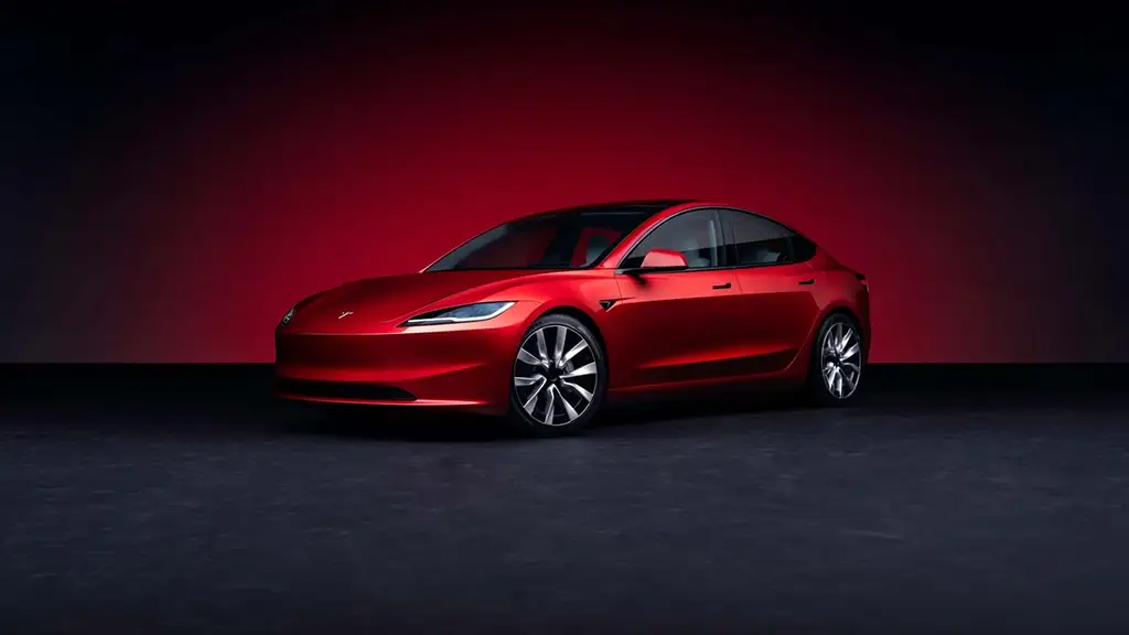
There’s seemingly no shortage of Tesla slander on the internet. Some can be a little unfair, and others can be… well, Tesla sometimes seems like it’s asking for it, doesn’t it? After nearly seven years, Tesla released its revamp of the Model 3, with minimal updates that reflect the vehicle’s minimalistic styling. While few have hit the road, we look to popular YouTuber Doug Demuro for the inside scoop on what we can expect to see from the new Tesla Model 3.
[Button id=”516″]
Quirks and features according to Doug Demuro
As we’ve already stated, and Doug agrees, the newly re-envisioned Tesla Model 3 doesn’t seem to have many new changes. Before watching the video, we were somewhat hopeful that he would enlighten us about some of his iconic “quirks and features” that would change our minds. At first glance, the most obvious cosmetic update to the EV is the front fascia, but Tesla is known more for user-focused updates, so we decided to hear Doug out.
Cosmetic updates for the Tesla Model 3
The front fascia of the car looks more like a mid-generation facelift than an actual update, and even at that, the changes are minor. The side body lines, door panels, and rear end of the car are noticeably unchanged, leaving us to believe this is hardly an update to the styling. If you are already underwhelmed by the appearance of Model 3, these “major revisions” aren’t going to spark your interest either. The good news is that Tesla continues to offer few features to allow buyers to customize their Tesla Model 3, with the exception being wheels and trim colors, so wrap shops and car customization businesses can rest assured that their place in the Tesla community will go on.
The rear end also has some subtle and barely notable changes to the rear end of the car, most noticeably in the taillight, which now forms more of the body of the vehicle than the outgoing model. Speaking of subtle changes, that is the best way Doug could politely describe the generally negligible updates to the interior.
Questionable interior changes for the Tesla Model 3
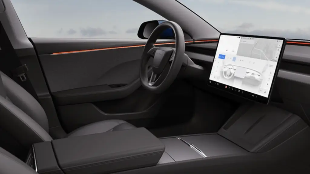
Sitting in the driver’s seat, Doug claims that although there aren’t many changes you can see, the overall quality of the textiles and surfaces has been updated. This is likely a direct result of owner complaints that the original Model 3 didn’t feel like a luxury car. New material choices on the dashboard and around the interior feel a bit like a page out of Lucid’s book, but we will give Tesla some credit for the effort.
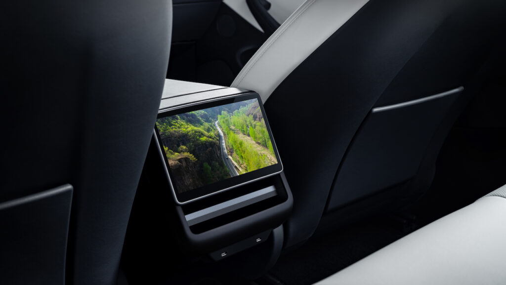
The biggest change to the interior doesn’t even involve the driver but rather adding another iPad-like screen to the rear of the car for backseat occupants. To Tesla’s credit, the addition of entertainment features such as Netflix, Hulu, and the arcade mode is a big bonus for some buyers. Neat.
Don’t worry, though. There is one major change for the driver, and… We hate it.
If you’ve never driven a Tesla, you may feel slightly confused when getting into the driver’s seat of the original Model 3 because it doesn’t start or engage like your typical vehicle. With the outgoing generation, gear selection was available through a stalk that protruded from the steering wheel, alongside traditional turn signals and windshield wiper controls. In an attempt to make the car even simpler, Tesla has removed the shifter and turn signal stalks and made users completely dependent on the touchscreen or controls directly on the steering wheel, making us feel more like we’re driving a giant iPhone rather than an actual car.
Don’t trust it? Right. Neither do we. This is probably why Tesla added a failsafe in the form of ceiling-mounted gear selector buttons, kind of like the engine start button in a, er, McLaren Senna. Odd parallel, we know.
[Button id=”517″]

